Royal Commission
& Board Of Inquiry
2016 - 2017
Client:
The Australian Government
Brief:
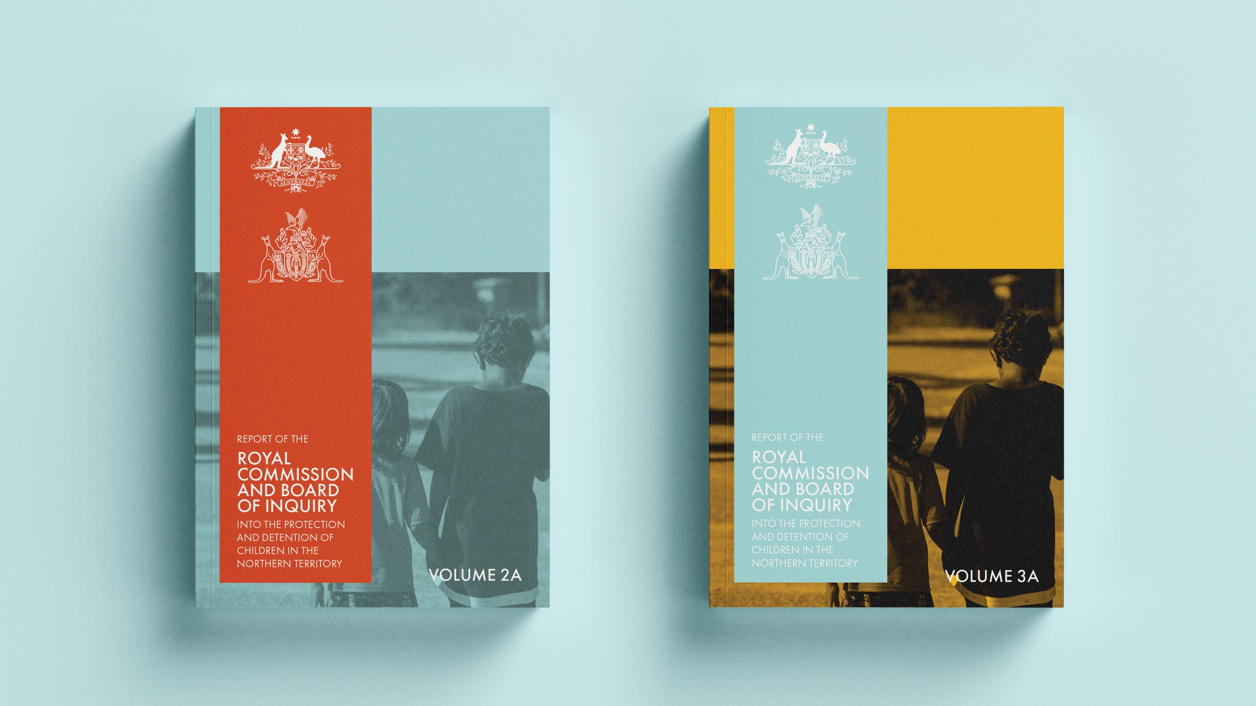
To design a multi-volume report that is accessible and easy to read. Adapting text-heavy content that focuses on sensitive and emotional subject matters, and creating a report that is digestible by using visual communication techniques and skills.
Skills:
Layout design, editorial design, infographic design and interactive design.
Outcome:
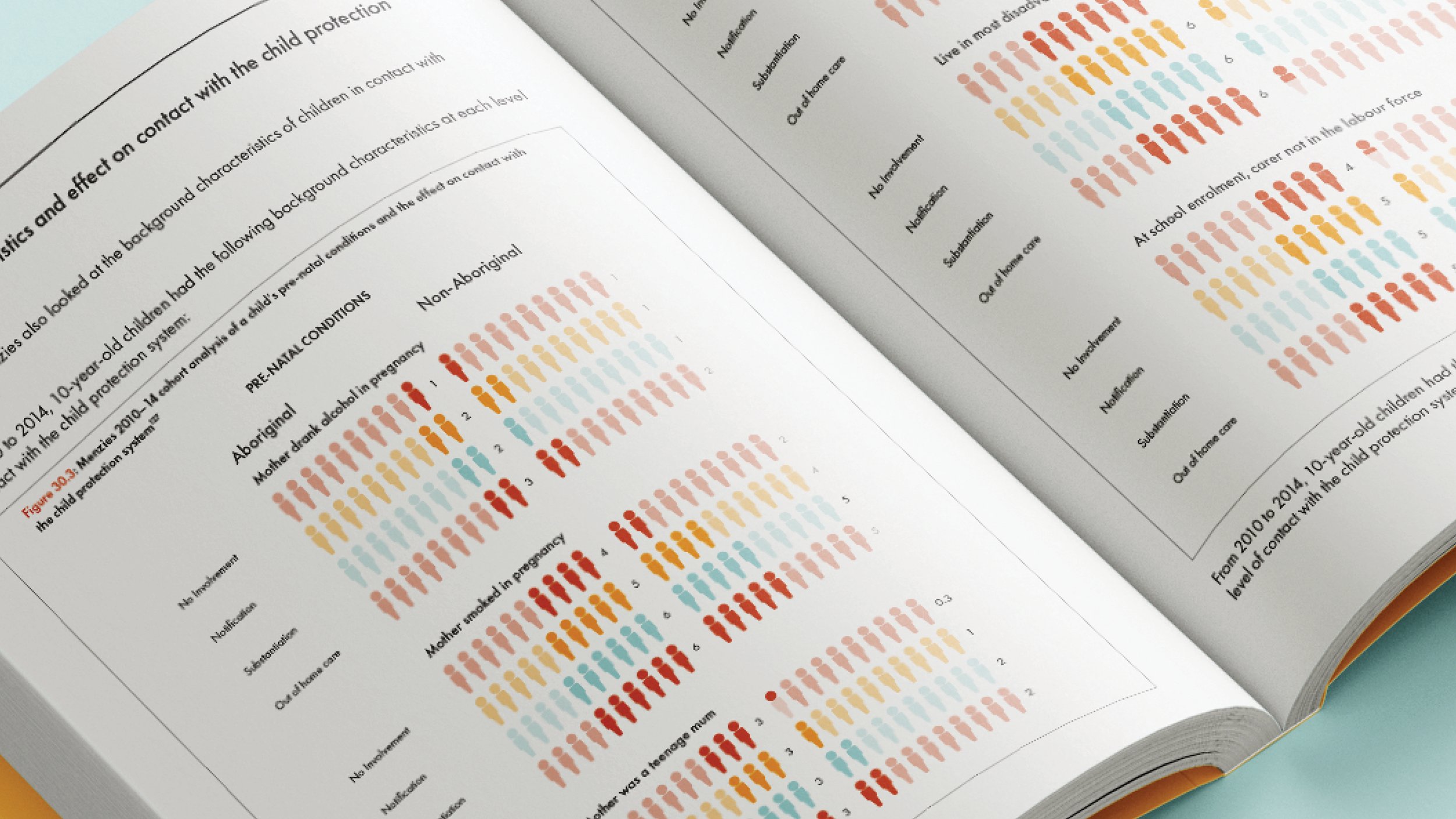
A 4-volume report that contains 6 different sections. The report used a colour scheme that represents Aboriginal cultures. The main colours are red, orange, yellow and blue which are associated with key elements of Aboriginal cultures such as earth, fire, blood, water, sky and stars. The report relied heavily on typesetting and layout design, with the text being broken up with infographics, maps, images and Aboriginal art. The report was printed and made into an interactive document, which uses the accessibility features of Adobe Acrobat, allowing greater accessibility for vision and hearing impaired readers.


